Do you ever wish you had more clues about getting your marketing research just right? Correlation mapping may seem complicated, but understanding the basics of this analysis technique will help you understand why it’s one of the most widely used concepts in statistical practices. With AI technology, correlation mapping becomes easier and more accurate. You can easily use the data you have to determine your next step.
What is Correlation Mapping?
Here it’s stated in its simplest form: Correlation mapping visually maps the relationship between two variables.
When you research the effect of a new marketing technique, you will measure how frequent the tool was used and the return on investment of it. For instance, you are trying to see if your target audience responds to your marketing campaign. Compare your sales figures to how much you spend on social media promotion, if there is a positive correlation (and not many other contributing factors that changed in that time period), you can assume there is a possibility the change had a positive impact on sales.
Numerical data about the two variables, such as sales figures and marketing expenses over a certain time period, will be collected. This data is plotted on a graph and the shape on the graph will represent the relationship between the two factors. They’re called scatter plots and dots on the graph represent the data.
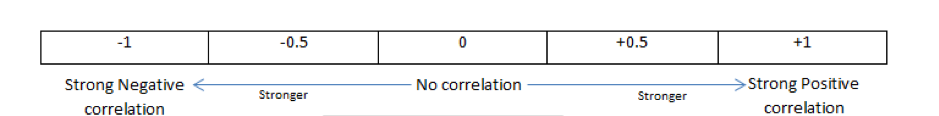
What Do the Different Outcomes Mean? (+1 to -1)
As an outcome of correlation mapping you will be given a positive or negative number between -1 and +1. This digit represents the relationship between the two concepts (such as sales vs marketing expenses) you tested.
Use this short reference list to remember what a correlation coefficient means:
- Positive numbers: This will tell you that if one concept increases, it’s more than likely the other variable will also increase; alternatively, the one will probably decrease if the other decreases.
- Negative numbers: When given a negative number you can expect the one variable to decrease if the other increases. (Vice versa as well).
- The number itself: This tells you how strong the relationship is.
- Zero: If the result is 0.0, there is no relationship between the two.
- One:1 (whether positive or negative) represents a perfect linear relationship.
In the example mentioned above about marketing campaign, a correlation of zero will mean your new techniques are probably not having the effect you expected. If there’s a correlation (positive or negative) it can show you whether you’re using the right features in your ads. If there’s a positive correlation you’ll increase the one aspect (marketing expenses) in the hopes of once again affecting the sales numbers.
Correlation Mapping Application
With Artificial Intelligence technology enabling you to analyse Big Data in more depth, the uses for correlation mapping becomes innumerable. Even if you have small sample sizes and limited data about them, correlation mapping still works. You can draw inferences:
- Clients: Is there a correlation between people’s ages and how many of a certain item they would purchase? Which changing business factors affect your customers? Which aspects of your customers demographics (age or geographical location) will prompt them to purchase more from an online store?
- Sales figures: Do sales improve when you improve customer service by employing more customer relations employees? This can help you determine if it’s a profitable investment.
- Products: Is there a correlation between the amount of product features you list on an eCommerce site and sales figures?
- Business: Measure which features of your business improves customer loyalty the most.
You Have a Correlation Map—What Now?
Note that in the statements above, we used terms such as “more than likely”. It’s important to note that many factors play a role in market and product research. You need more than a simple correlation graph to prove there’s a direct relationship between two factors.
Therefore, correlation mapping is not the only research method to use; it’s a dynamic starting point in researching data about your industry. Correlation mapping is most effective as part of a larger analysis study. With this method you can get it right. It’s your first clue to make your next project more effective.
